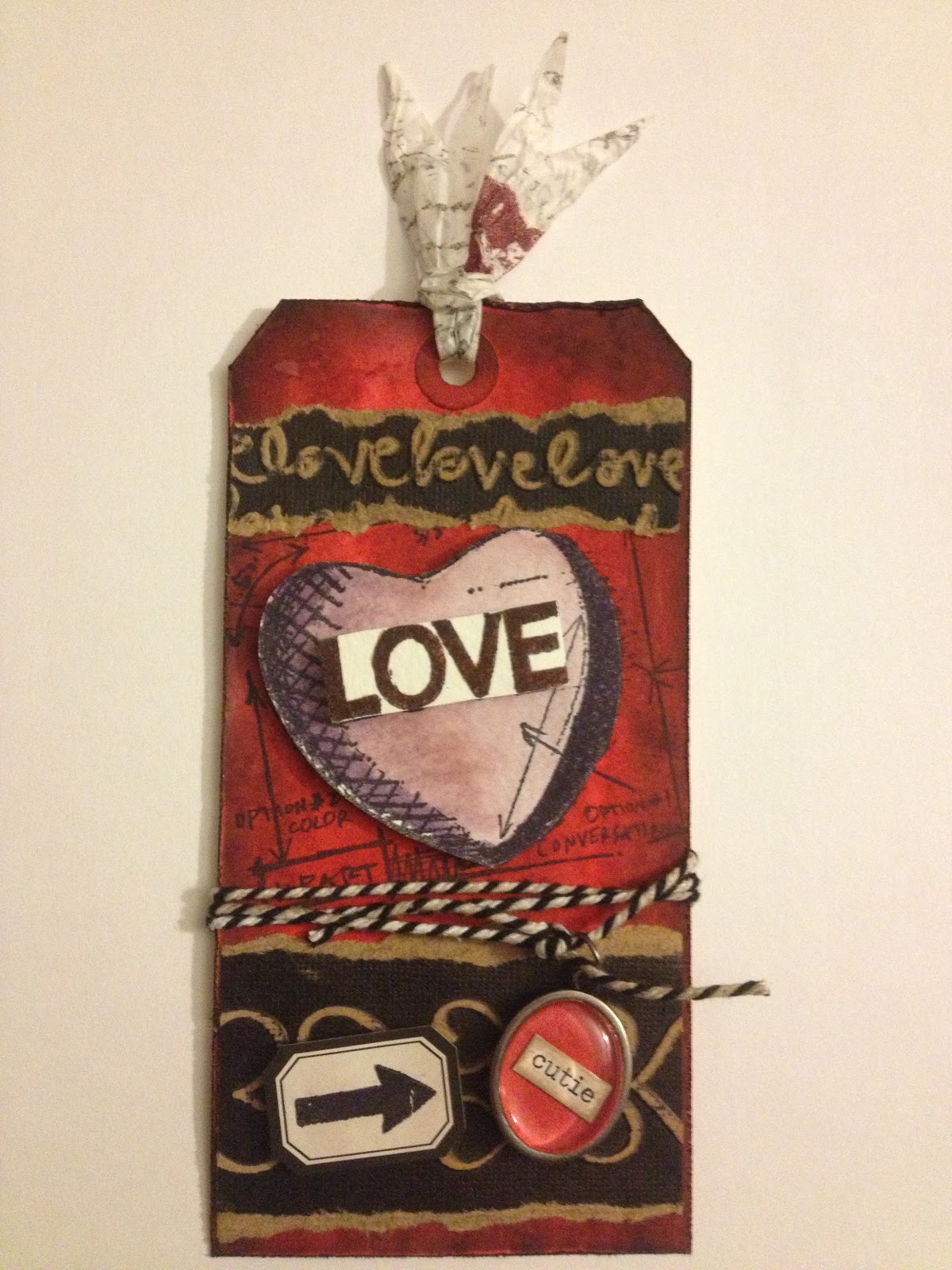
After my first few posts, an excellent question was raised on Facebook: "what is an LTC?" Simply put, an LTC (or Letterboxer Trading Card) is an ATC that includes a hand-carved stamp. (Don't worry if you didn't understand anything in the previous sentence; I'm about to explain all.) :-)
First, let's take a look at ATCs, or Artist Trading Cards. ATCs are miniature works of art, the same dimensions as a baseball card (2.5x3.5"). They can be made out of any number of different materials, in varying styles. They are traded, and occasionally sold. For more info, check the
Wikipedia page, which not only describes them well, but links to several popular sites for trading/obtaining ATCs.
So now the question turns to: what's does "Letterboxer" refer to? Letterboxing is a treasure hunting hobby. Usually it is compared to
geocaching, but there are several key differences. Instead of relying upon a GPS unit to seek their treasure, letterboxers follow clues (which can range from rather straight-forward directions to mind-bending ciphers). And at the end of a letterbox hunt, instead of a cache of Happy Meal toys and pencils (let's be fair, that's been the contents of almost every geocache I've encountered), the seeker finds a letterbox, containing a rubber stamp and a logbook. The seeker carries their own personal stamp and logbook, and images are exchanged. The personal stamp is stamped into the letterbox logbook, and the letterbox stamp is stamped into the seeker's personal logbook. Then the letterbox stamp and logbook are rehidden for the next person to find. Most stamps that one finds while letterboxing are hand-carved, meaning that the images you collect in your logbook are one-of-a-kind. More info about letterboxing can be found on two main websites:
AtlasQuest, and
Letterboxing North America (LBNA).
I started letterboxing in April 2009, a few months after reading an article about it in the Buffalo News. (Since most letterboxes are hidden outdoors, I wasn't tremendously keen to start in the winter - I waited for better weather!) Letterboxers usually choose a "trail name" by which they are known in the letterboxing community, and BfloAnonChick is my trail name. (My real name is Liz. *waving*) The photo next to my blog profile shows my personal stamps. The torso with the name below it were carved by me, and are my current signature stamps. The pair of eyes below was store-bought, and was the signature stamp I started with when I first began letterboxing. I don't use it in logbooks anymore, but I still sometimes use it to "sign" the backs of my LTCs.
And here we are, back at LTCs. So what do artist trading cards have to do with treasure hunting in the woods? Well, several years ago, someone suggested that perhaps the same hand-carved stamps that were being placed in letterboxes, could be used to make ATCs. A letterboxer named
Mama Cache hosted the first swap of these new ATCs, which were renamed LTCs, to reflect the use of a hand-carved stamp. (Some letterboxers do create cards using store-bought stamps, but it is generally accepted that for a card to be considered an LTC, the stamp that is the main focus of the card should be hand-carved. I have occasionally used store-bought stamps as accents or backgrounds, but any card I make that focuses on a store-bought stamp, I would consider an ATC, and trade as such.)
Since then, thousands of LTCs have been made and traded by hundreds of letterboxers. I began making and trading LTCs in July 2009, and I haven't looked back. Here are some of my favourites from over the years:
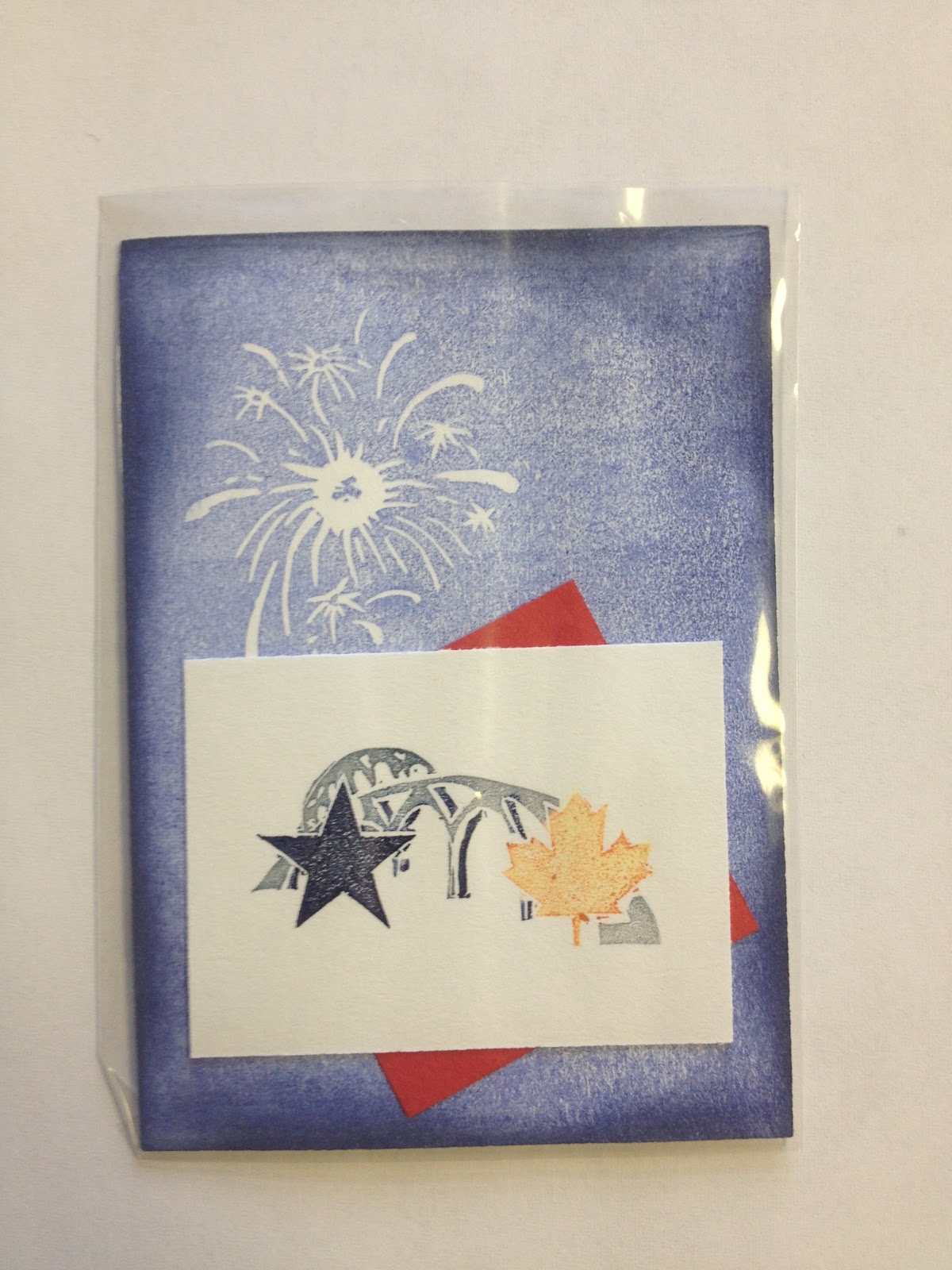
This was my first card, created to celebrate the annual Friendship Festival in Buffalo, NY & Fort Erie, ON.
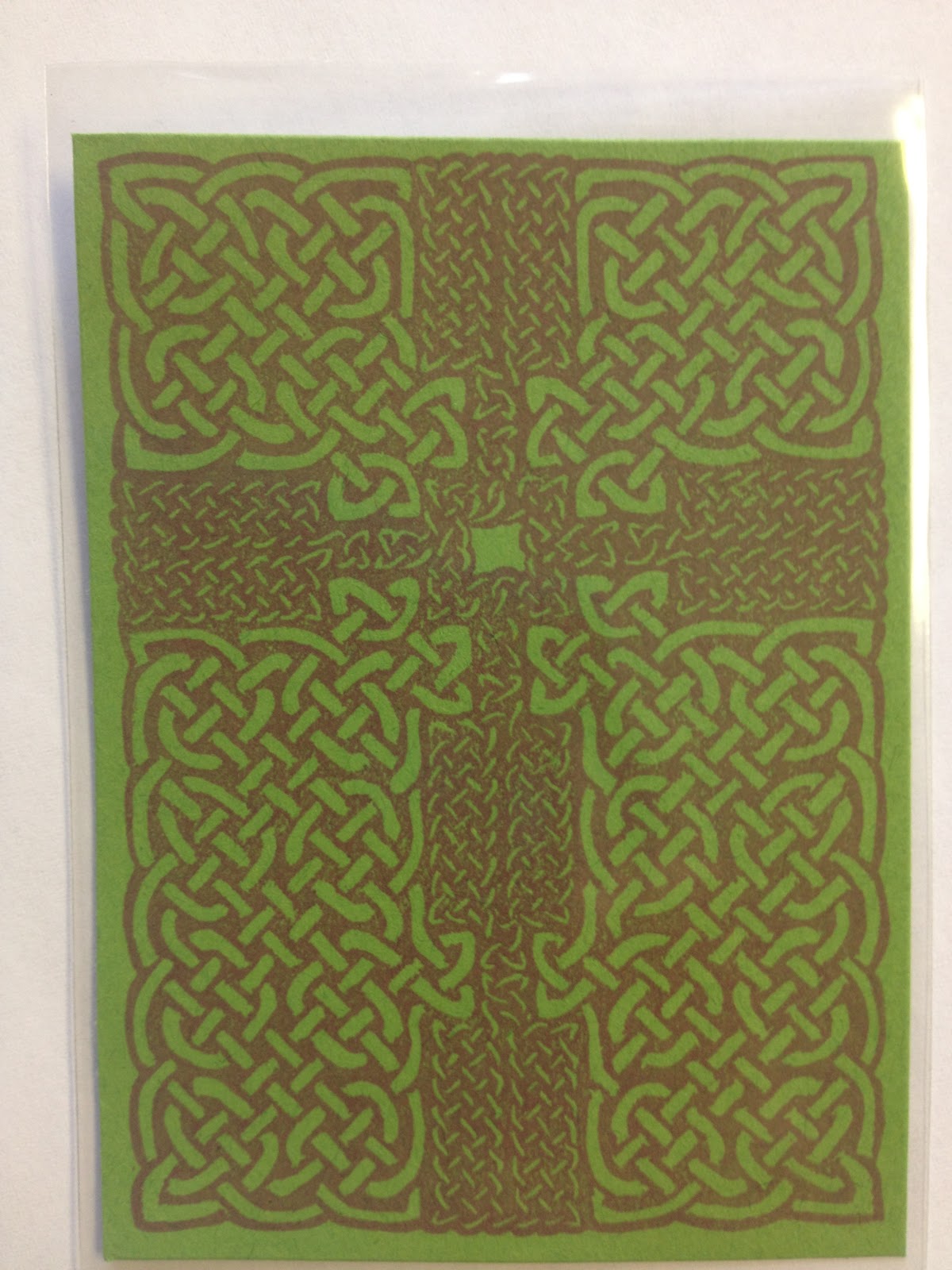
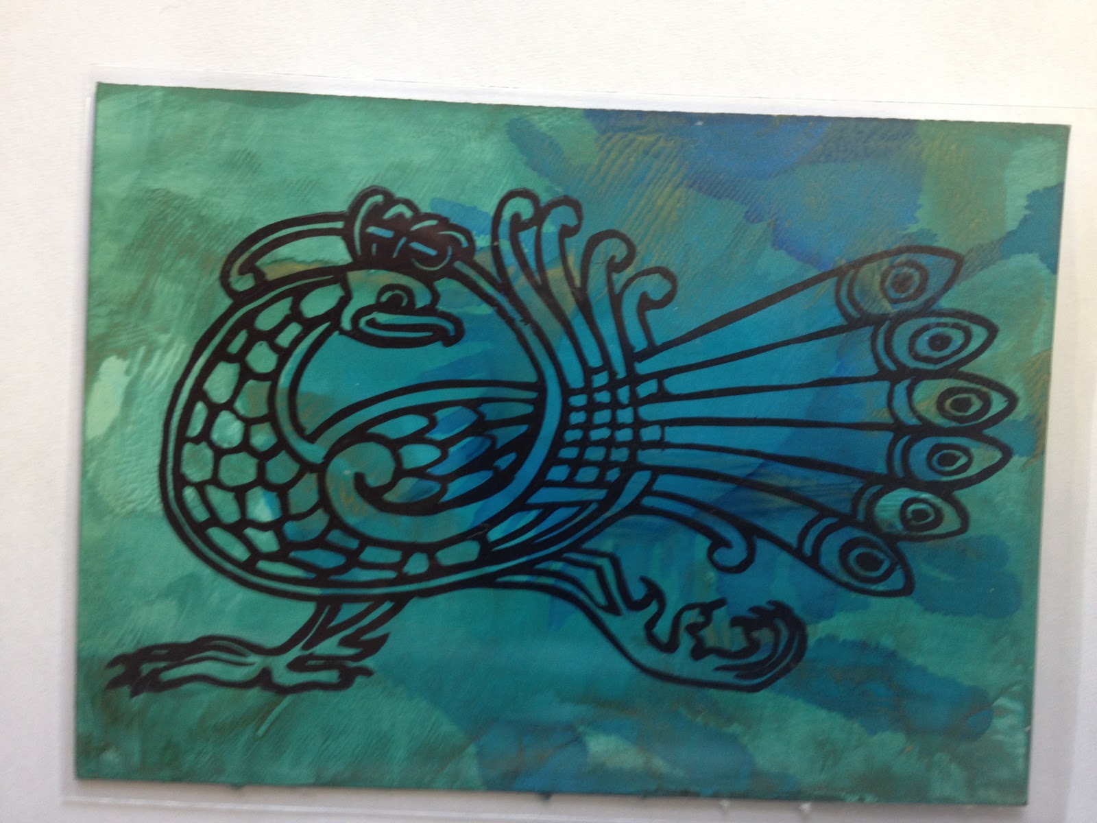
I do a lot of Celtic knot-inspired images, because I think they're fun to carve. :-)
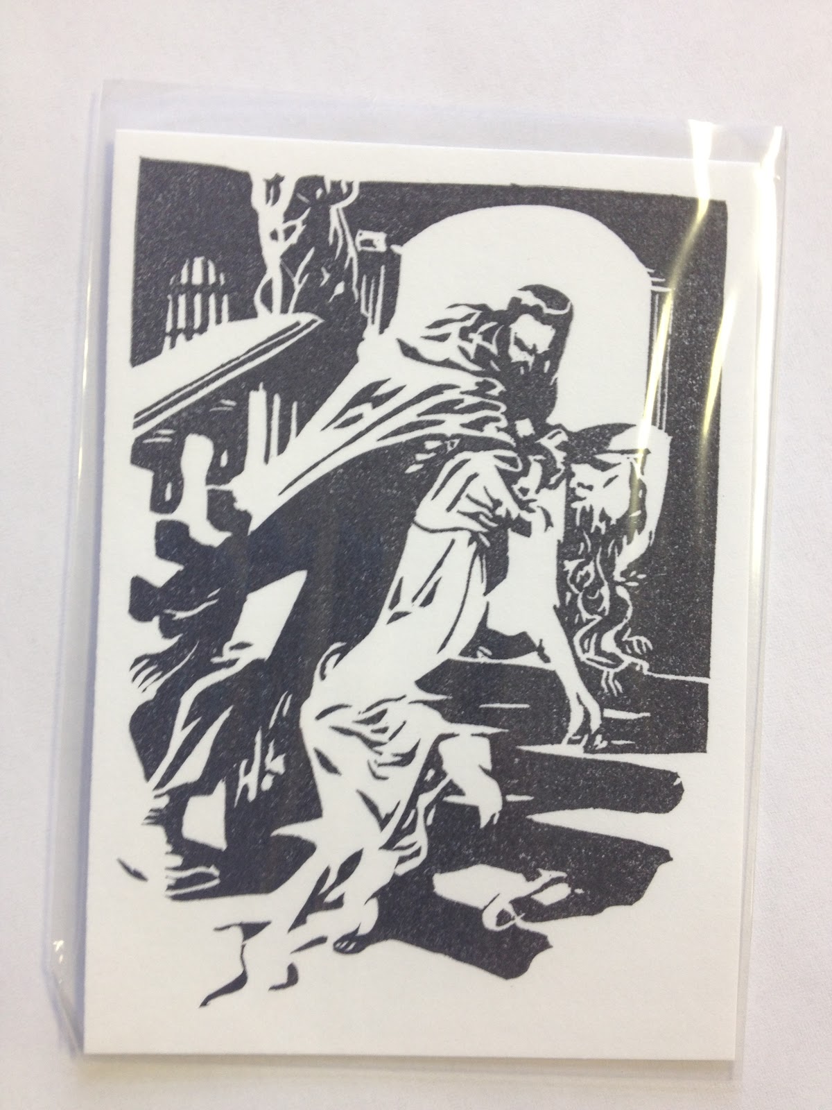
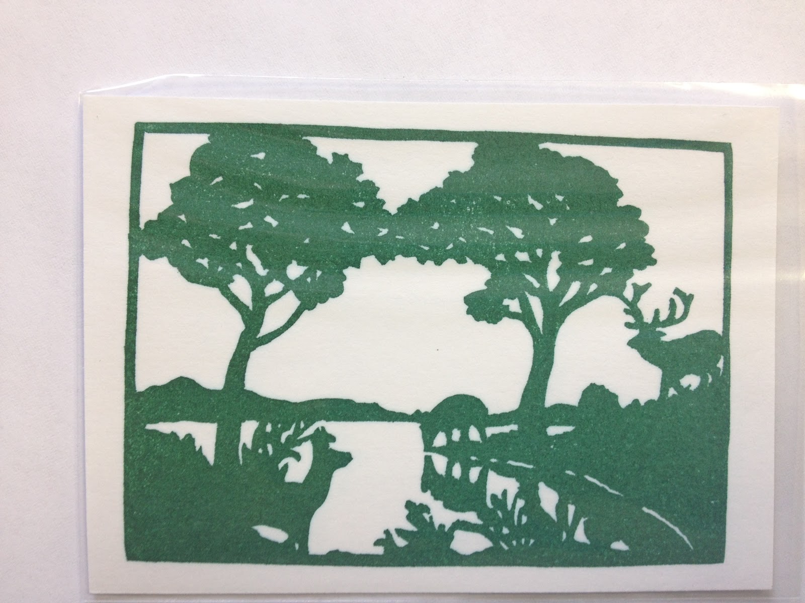
Sometimes I go simple, and just let the carve speak for itself.
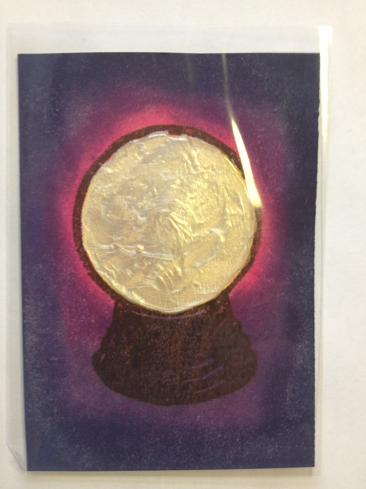
Backgrounds and papers can make for fun experimentation...
As can unusual materials. (Yes, that's really duct tape!)
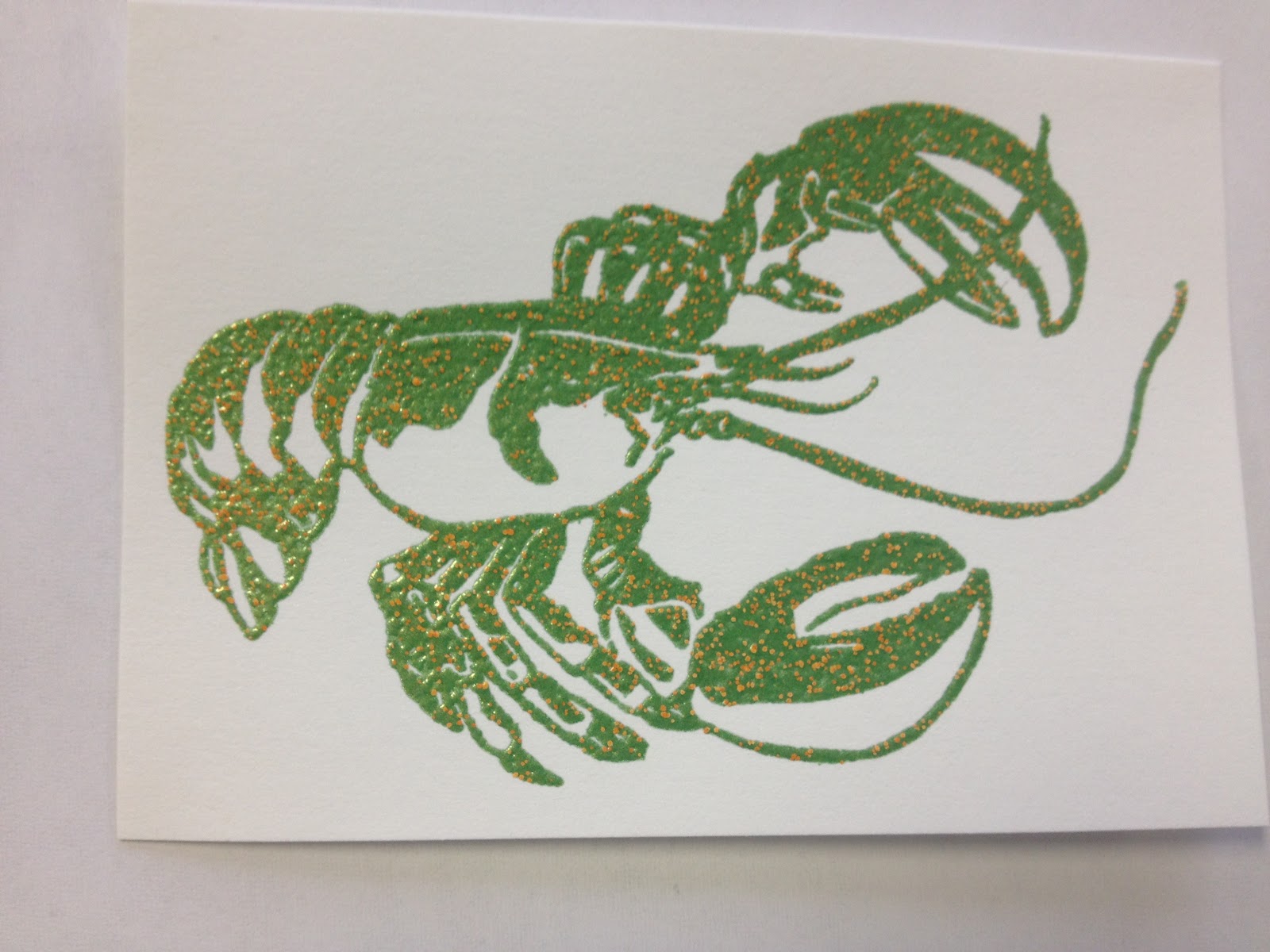
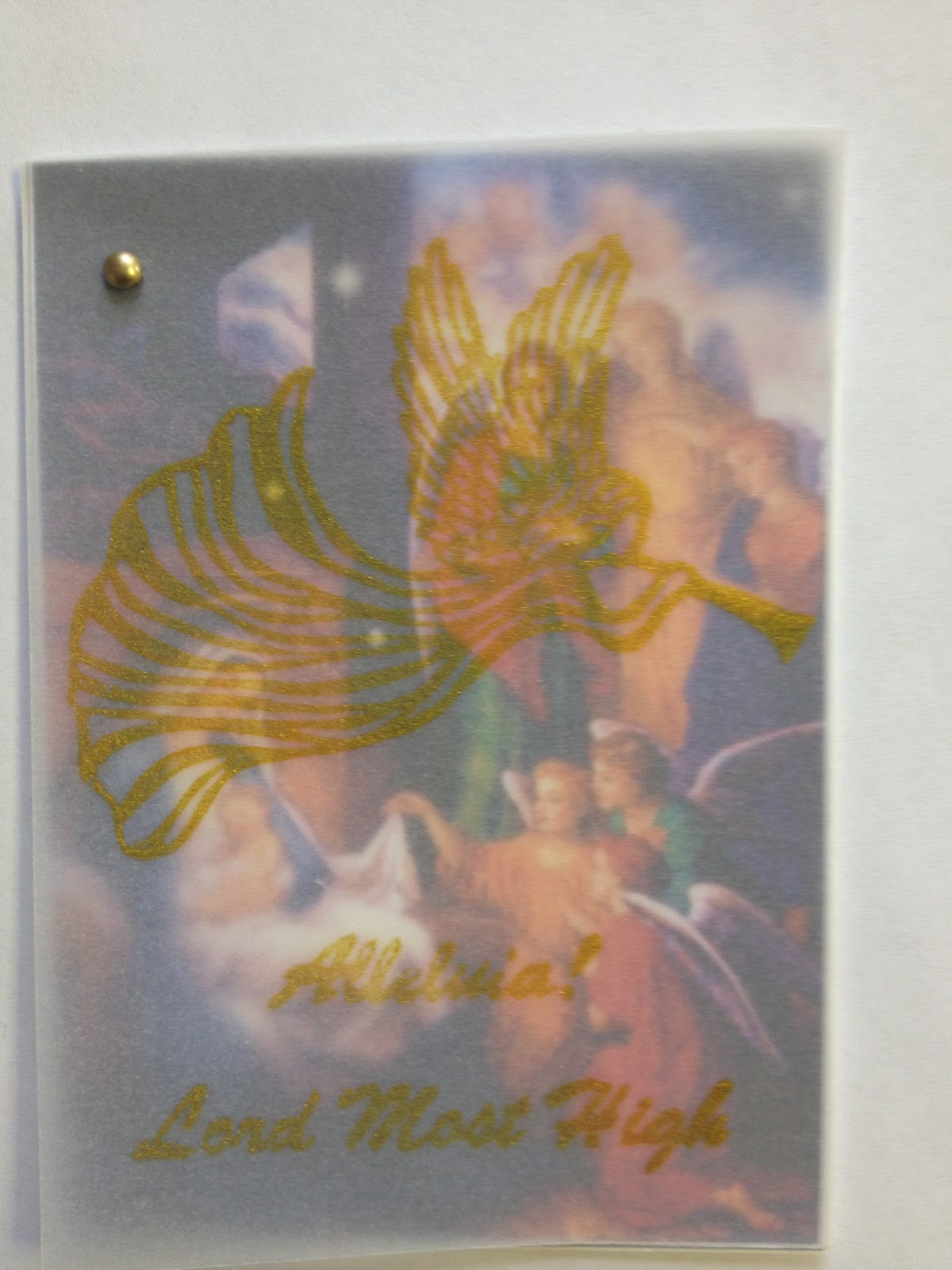
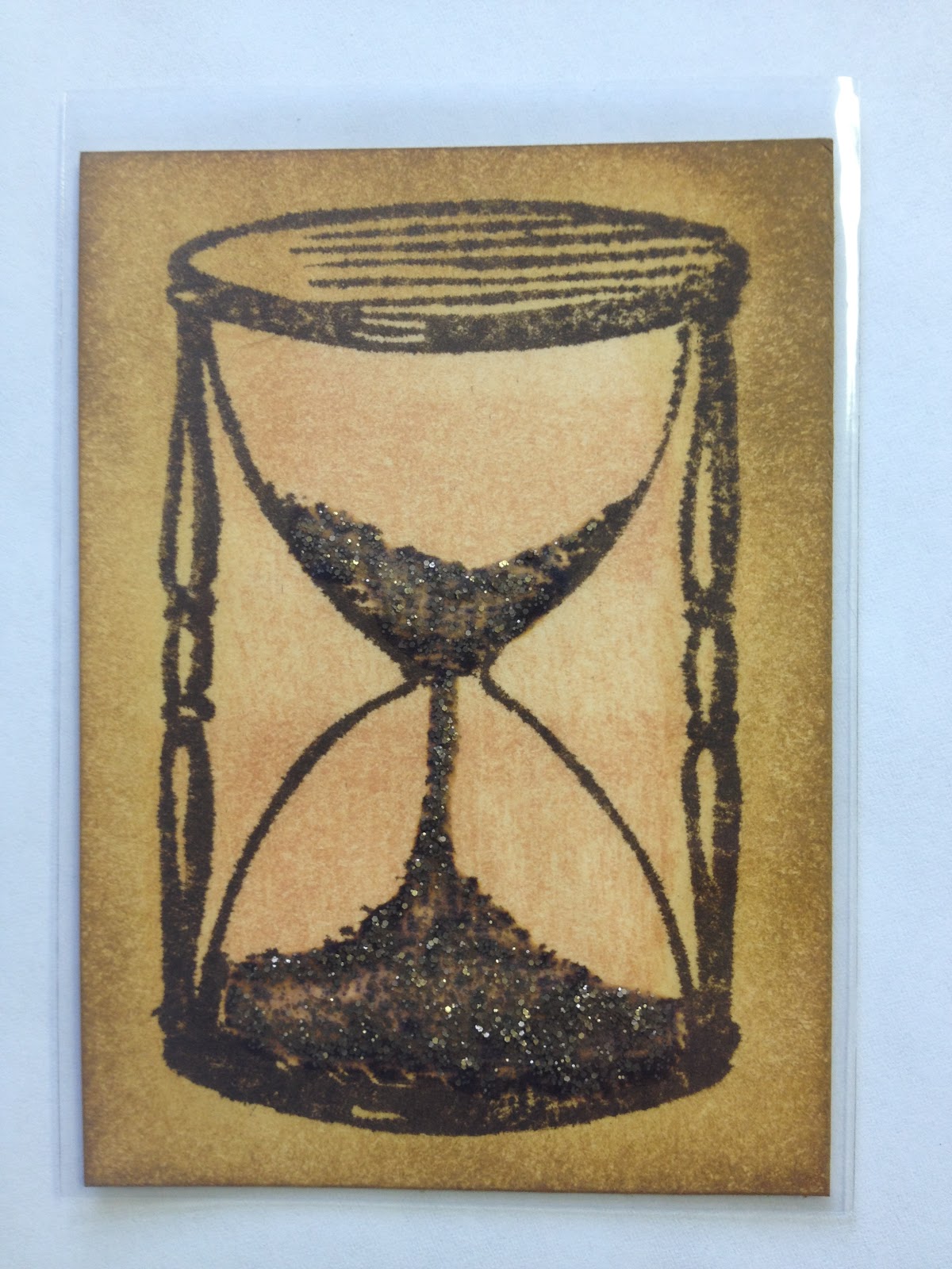
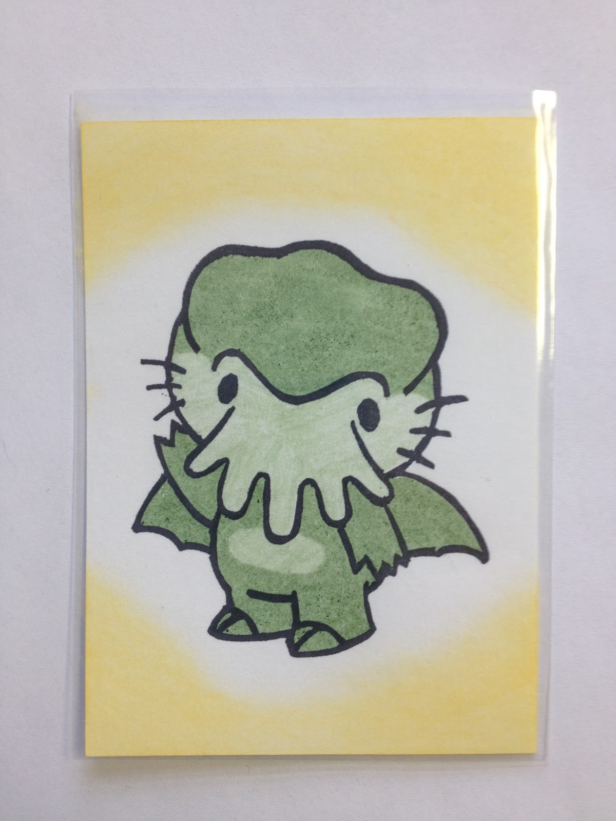
I love using my Distress inks to get a multitude of different effects.
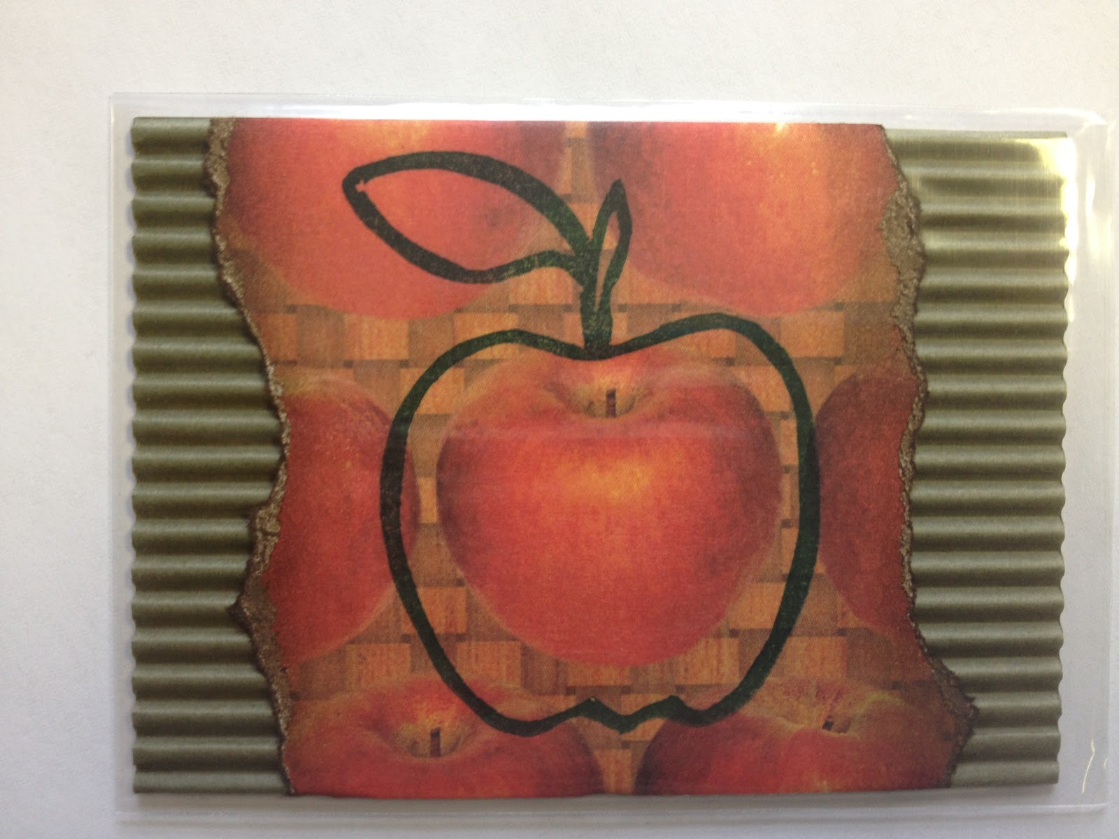
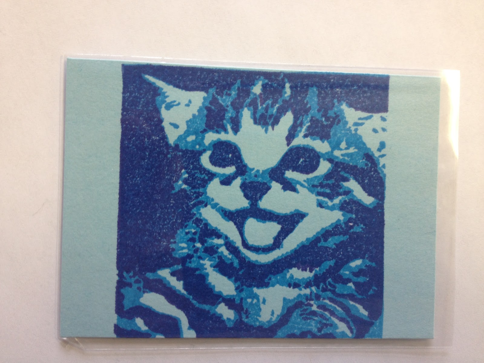
These cards all use texture as part of their design.
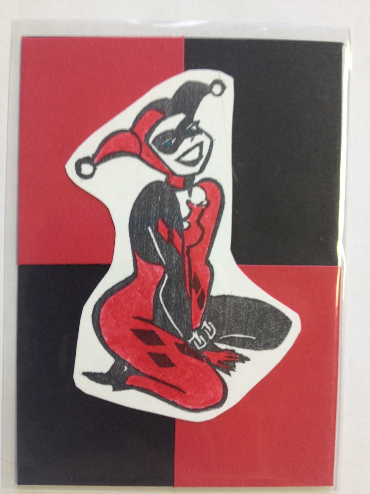
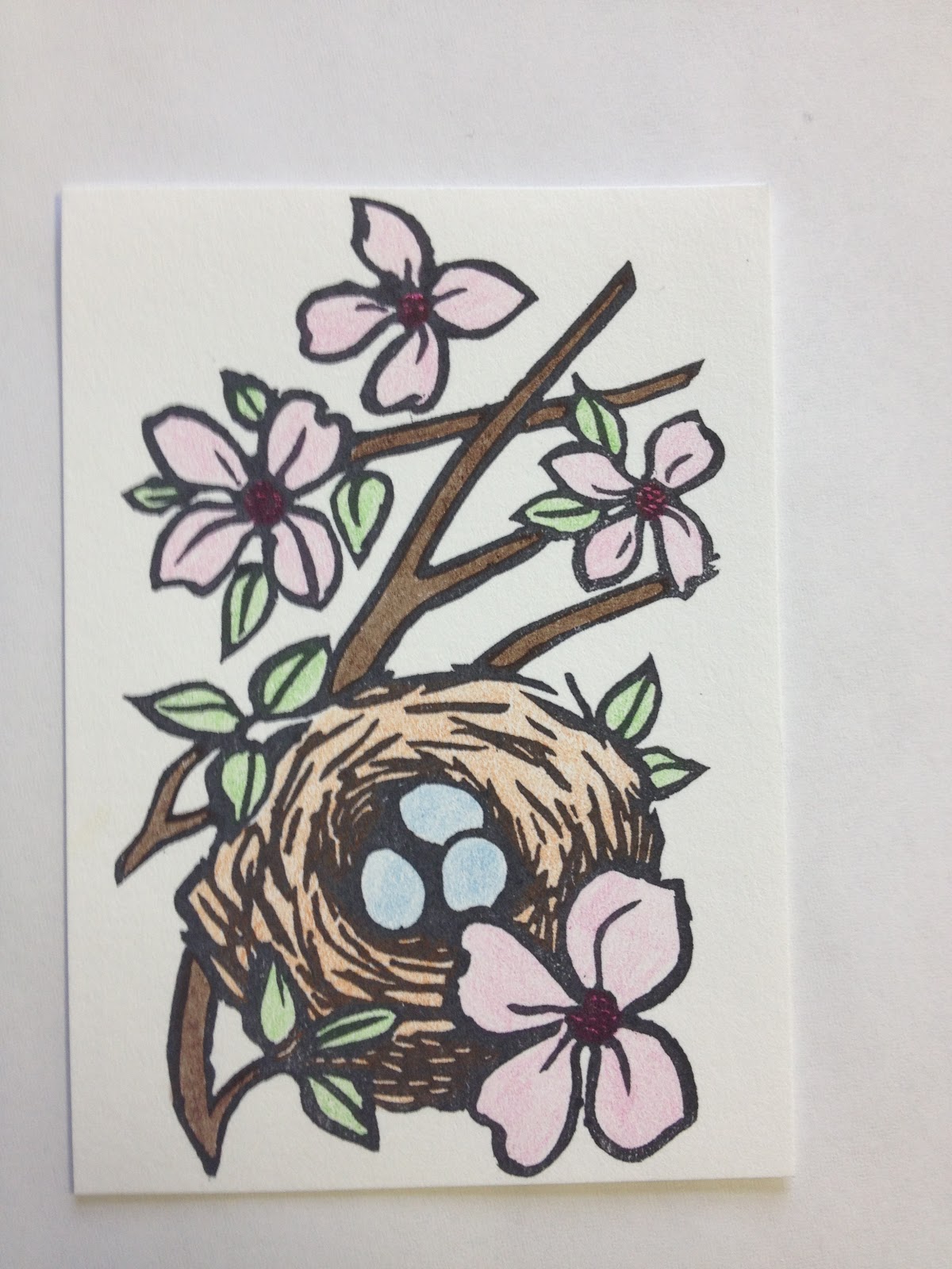
Colorr can be added many ways, including coloured pencils, blending chalks, and Copic markers.
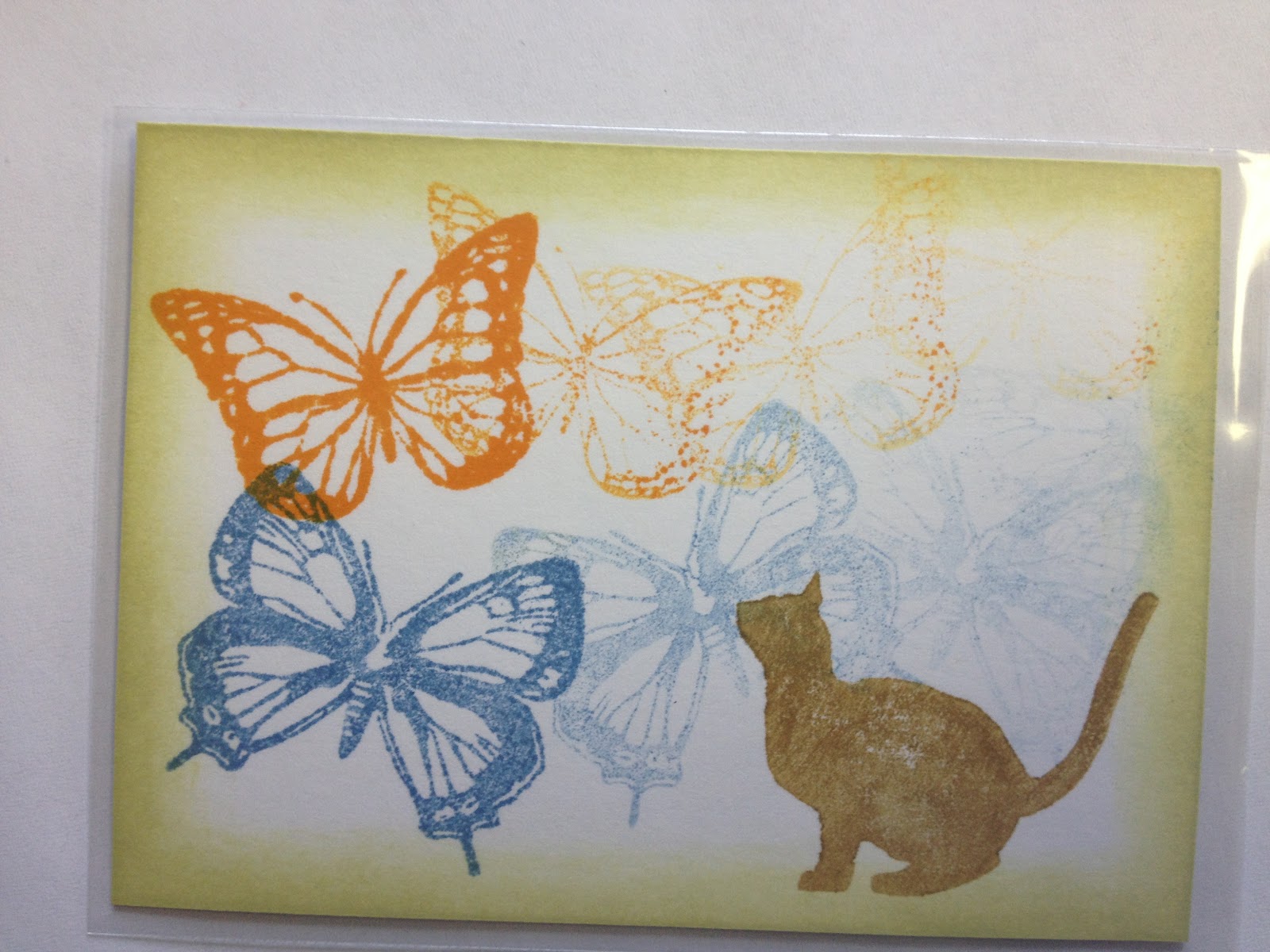
One of the cool things about carving your own stamps, is the ability to layer images.
The above card was made by layering 2 different stamps.
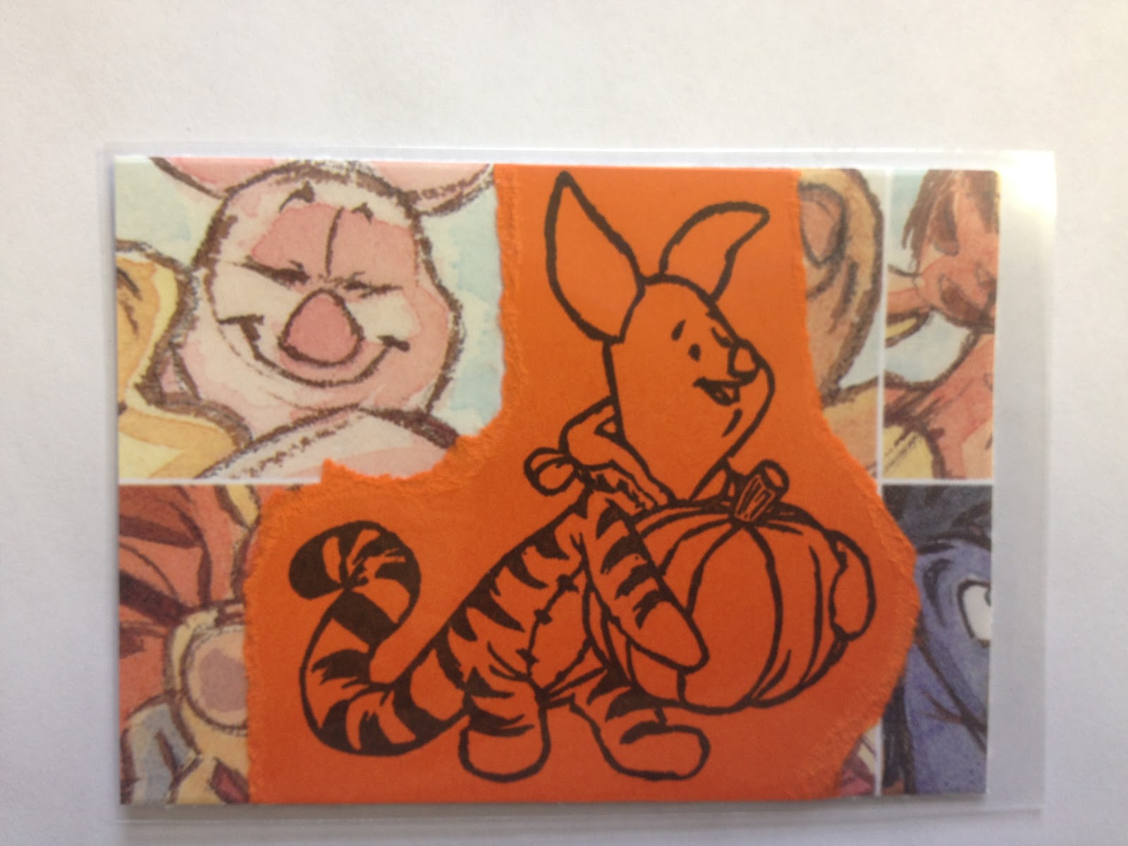
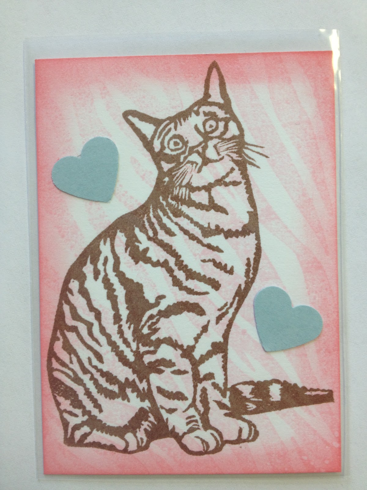
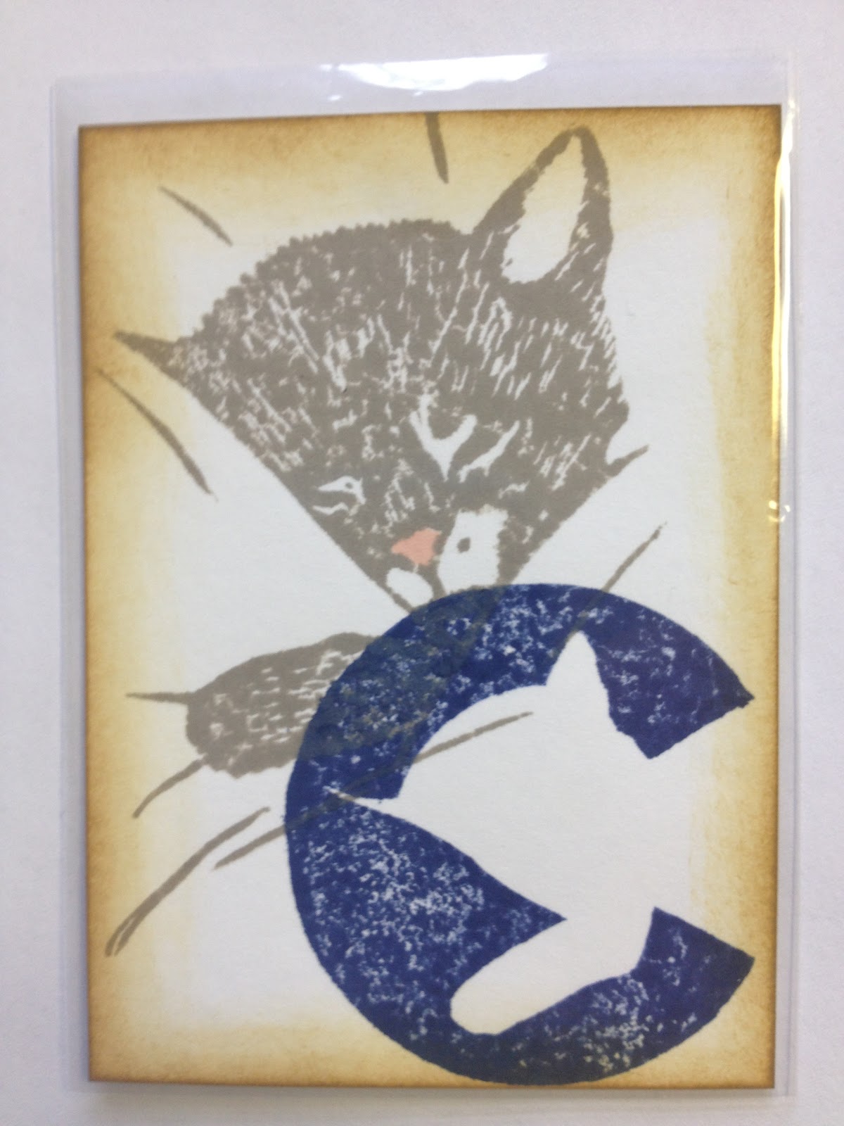
This card emerged from a swap where the butterfly stamps were sent to each participant, to see what they would make with them. The cat is my carve, and the above is my design using all 3 stamps.
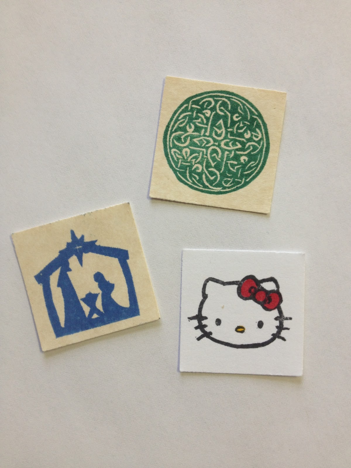
A newer development have been subsets of LTCs known as inchies (1 inch square),
and twinchies (2 inches square). Above are 3 inchies from my collection.
And this is me (anime style). Yes, I have a blue streak in my hair. It makes me smile. :-)
So that's what LTCs are all about, along with some of my examples. I'm far from the only LTC maker blogging, so google around for more examples. We have some amazing artists!
If there's a card above that you'd like to know more about how it was constructed, feel free to comment below, and I'll make it the topic of a future post. :-)