Here's the second project I have to share with you today. I created it for SimonSaysStamp's Monday Challenge ("D is for Distress"), but will also be submitting it to SimonSaysStamp's Wednesday Challenge ("Simon Says Tag It"), to Inspiration Journal's March Challenge ("A Splash of Colour"), and to A Vintage Journey ("Anything Tim Holtz").
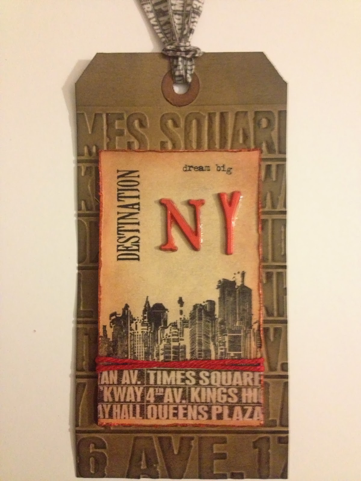
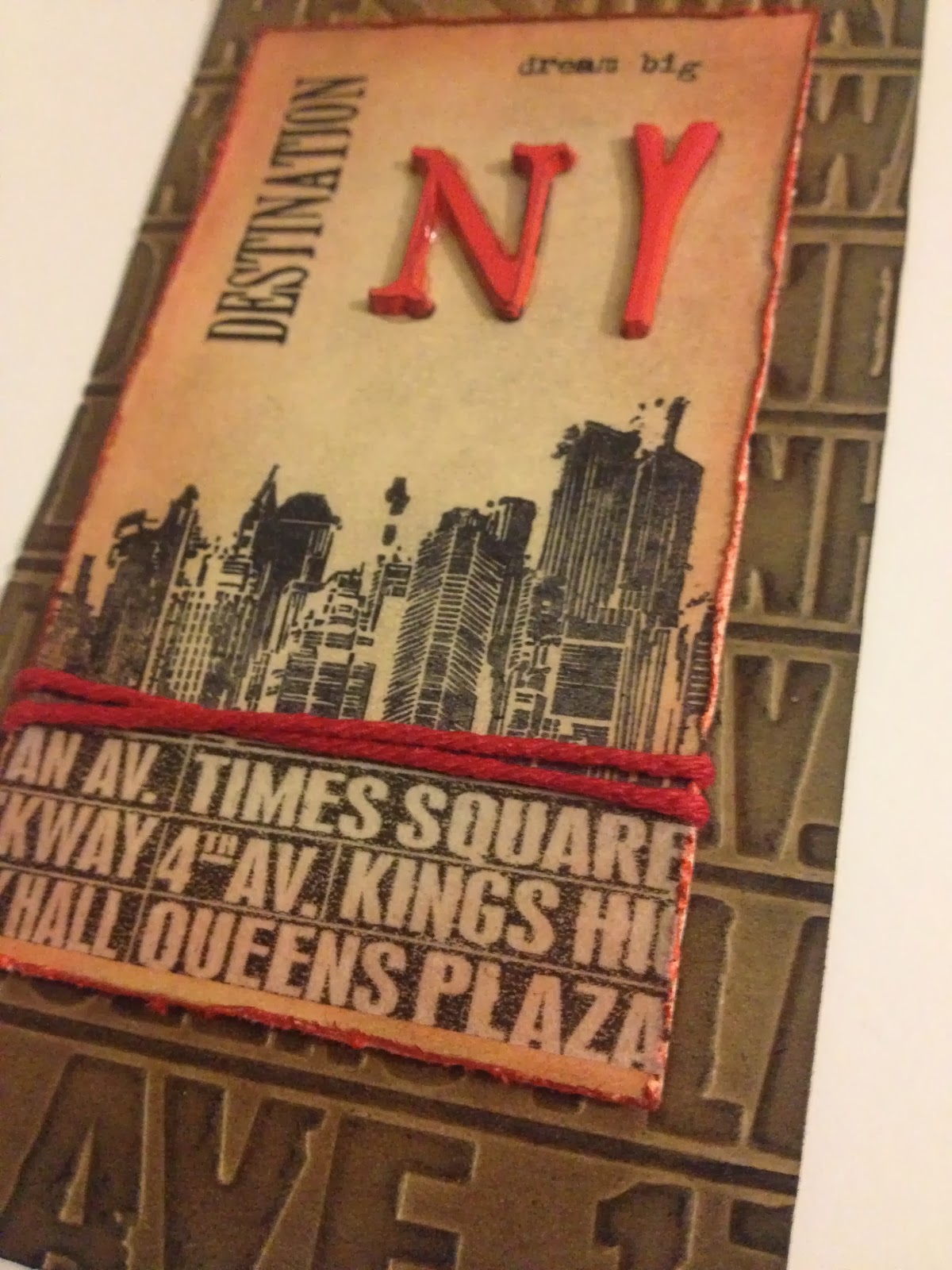
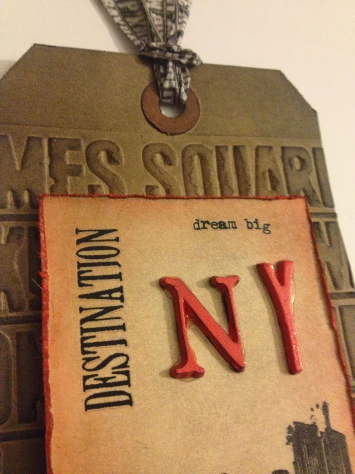
Here's my tag:
Materials/tools used:
- Ranger Inkssentials #8 Kraft tags
- Ranger Inkssentials #5 Manila tags
- Ranger Distress Ink: Barn Door, Black Soot, Pumice Stone, Walnut Stain
- Ranger Distress Paint: Barn Door
- Ranger Archival Ink: Jet Black
- Ranger Glossy Accents
- idea-ology: Alpha Parts (Ransom), Remnant Rubs (Words), Tissue Tape (Commute)
- Maya Road Twine Cording Solids: Cherry Red
- Ranger Heat Tool
- Ranger Inkssentials Foam Blending Tool
- Sizzix Big Shot
- Sizzix Texture Fades: Subway
- Stamp by Tim Holtz for Stampers Anonymous: CSS27911
- Tonic Studios: Craft Scissors, Paper Distresser
- Paper trimmer
- Foam dots from my stash
Okay, I need to start out by saying that I LOVE Tim's subway design, as seen on the embossing folder and tissue tape I used on this project! In fact, if you ever see me in person, chances are the bag I'll be carrying is this one (from the idea-ology District Market line):

That said, I do have a couple of quick notes:
- If you're as impatient as I am, you probably grab your heat tool to help speed your Distress paint as it dries. Not a bad thing, but be careful heating Alpha Parts, especially ones with thin areas like the ones I used! You'd think after the last time, I'd remember, but my letters still warped slightly. :-/ I loved the way the red in the main portion of the tag pops, though, and I think painting the letters was absolutely the right choice.
- The other thing I found was that in the course of painting the Alpha Parts, I got some paint on their backs (don't ask!), which detracted from their stickiness. So I used some Glossy Accents to adhere them. It worked well, but came out a tiny bit messier than I'd have hoped.
- I love the various texture fades/trades embossing folder, but I have found over time that sometimes they crease the paper/cardstock so sharply that it can weaken and become prone to ripping/tearing. This happened with the first Kraft tag I ran through when beginning this project. I started inking it up, and it started separating along the embossed lines between the words. So, I ran 2 tags together through the embossing machine, and that worked great! The tag for my project was embossed nicely, but not too deeply, and I already have a second tag embossed with that design for a future project. :-)
More views:
Well, that's it for now, though if what they're saying about our weather tomorrow is true, I might have more for you quite soon!
'Til then!
BAC
A great vintage tag with lots of grungy colouring and fabulous texture. The splashes of red add interest and focus and I love the added remnant rubs. Thanks for bring this on A Vintage Journey with you and joining us on our travels xx
ReplyDeleteA nice tag.
ReplyDeleteReally stunning tag! Love the NY theme! So cool! Thank you so much for joining us at Simon Says Stamp Monday Challenge. Hugs, Sandra
ReplyDeleteI love your NY theme and the fabulous texture and colouring on your tag. Thanks for sharing your great vintage make with us at A Vintage Journey for our first challenge. Jennie
ReplyDelete